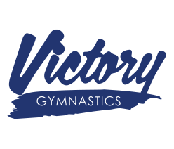
A simpler logo for Victory Gymnastics
The problem
Victory Gymnastics had a good-looking logo that was hard to use. Embroidered or printed on team apparel it was difficult to read, and its colors clashed on other backgrounds.
What we did
We redesigned it as a one-color wordmark in bold, energetic lettering that suits a sports club. Fewer parts and simpler shapes make it readable at small sizes, and a single blue works on everything from business cards to leotards. A white version covers dark backgrounds.