When it comes to branding, logos are a vital part of any organization’s identity. A good logo can help to establish a connection with your audience, convey your message, and create recognition. However, after some time, logos can become outdated and lose their relevance. This is why it’s important to refresh your logo periodically.
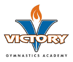
In this blog post, we will discuss how to refresh an older logo to something more current and simpler. The logo that I updated was the Victory Gymnastics logo. The old version can be seen below. While it was pretty nice, the client wanted something simpler – embedding this logo on gymnastics apparel was hard to read and the colors made it difficult to use on other colors.
Refreshing the Logo
An outdated logo can make your organization look out of touch and irrelevant yet a refreshed logo can help to convey that your organization is fresh and hip, attracting new audiences and increasing engagement with existing ones. Additionally, a refreshed logo can help to differentiate your organization from competitors, establish a strong identity, and make it more memorable.
Much Simpler Design
Simplicity is key when it comes to modern logo design. Rather than using complex shapes and colors, modern logos tend to be simple and easy to recognize. One way to refresh an older logo is to simplify the design. For instance, you could reduce the number of elements in the logo or simplify the shapes used. This will make it easier to recognize and will give it a modern feel.
Changing The Look
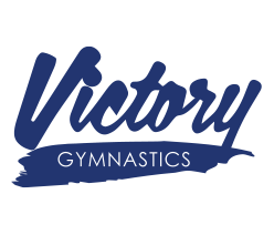
Since the client was fitness/sports-related, I felt that the “varsity jacket” look was something I could use in the new design. It involved using bold, block letters with a single color.
One Color Design
Using a single color in the logo would help to create a clean, modern look. A monochromatic color scheme is simple yet striking, and it can help to make your logo more versatile. By using just one color – in this case, blue – you can ensure that the logo looks great in all applications, from business cards to gymnastics leotards.
Below you can see the updated version of the logo: one color and simpler to read. The logo could be inverted to white on non-white backgrounds. When the logo was reduced in size, folks could still tell it was the Victory logo due to the shape.
Final Thoughts
In conclusion, refreshing an older logo can help to modernize your organization’s identity, making it more relevant and memorable. To achieve this, you can simplify the design, and use just one color. By doing so, you can create a logo that is modern, versatile, and eye-catching, helping to establish a strong connection with your audience.